Karyn Jimenez-Elliott Talks Design, Teaching, and Her New ‘Anti-Textbook’
One of the best things about being a part of the Graphic Design program at Johnson & Wales is the professors. Whether you are taking a design class as an elective or majoring in it, the professors are there to guide you. Among these amazing professors is Associate Professor Karyn Jimenez-Elliott.
I have had the privilege to have Jimenez-Elliott as a professor for all but one of my semesters at JWU. Her passion for design and teaching shows through her students. She brings her own professional projects and experiences into the classroom so students can work on projects that they might find in the real world.
Despite already juggling teaching and freelance work, Karyn recently wrote her own academic book on typography, “The Gravity of Typography.” I asked her some questions to learn more about her as a designer, professor, and most recently, as an author.
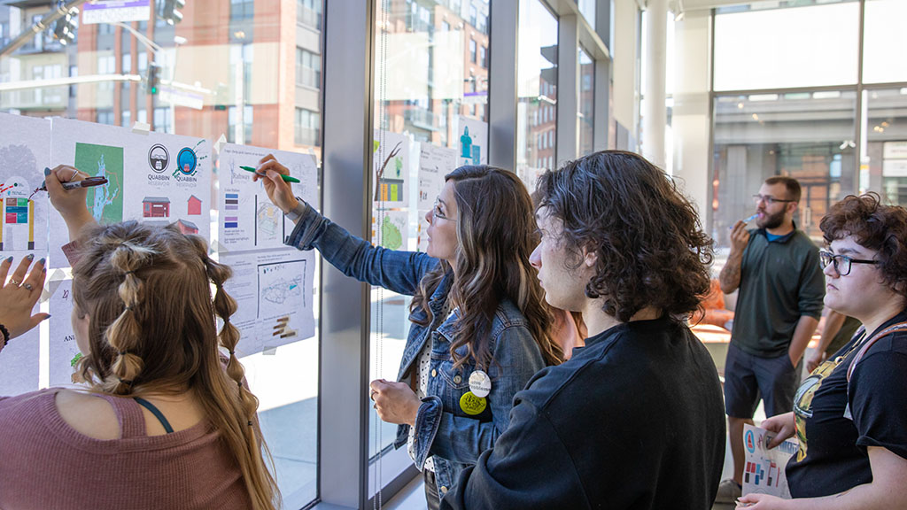
JIMENEZ-ELLIOTT (CENTER) WORKS WITH STUDENTS ON THEIR DESIGNS IN THE BOWEN CENTER GALLERY SPACE.
How would you describe yourself as a designer?
Design is more than just a profession for me… it’s part of who I am and how my brain works. I use it as a means of processing emotions. Whether it’s for or against something, or for a cause (such as animal welfare) that I am passionate about. I definitely have a style I gravitate towards, balancing out clean vector elements with hand-done elements. However, I am always challenging myself to try new industry trends and aesthetics that are outside of my typical style. As a designer, it’s important to be versatile so you can design for any target audience.
What is the best part about teaching graphic design to college students?
One of my favorite parts of teaching is watching students develop as designers. With each class they take, I get to witness their confidence and skillset evolve… there is a moment, usually in their sophomore spring semester, when you see things just click for them — it’s really awesome. In my classroom, there is a mutual level of respect for one another. I challenge them, which they appreciate. My goal isn’t to just get them through the door but rather to help produce successful, creative, resourceful, skilled and thoughtful future colleagues. I develop such a rapport with my students that it is always extremely difficult to say goodbye at graduation. Fortunately, I stay in touch with many of my alum, so it isn’t a true goodbye.
Where do you find most of your inspiration?
I’m passionate about design for social impact and often find myself designing in response to current global events. Some people write and that’s how they flesh out their emotions. Design is my version of that, and many of my projects are my personal responses to global and societal issues. It helps me process. Where my heart and mind find most joy though, is in donating my design services to various animal rescue organizations… from Kuwait, Portugal, Spain, the UK, to various states across the U.S. I think it is so important for artists and designers to use their talent to help make a change — regardless of your skillset, we should all strive to be part of something larger than just ourselves.
In March of 2023, my son Greyson and I developed a registered nonprofit of our own, The Greyson Hound Foster Fund. It was conceived out of the continual need to help families and organizations fostering rescued sighthounds. Many of them come from situations that leave them with medical needs, or transportation to get them to a safe place. We have helped 12 dogs in the short two-and-a-half months we’ve been up and running. We are currently fundraising to transport five Saluki pups that were rescued from a Friday Market in Kuwait, here to R.I. There is a saying, “Saving one dog won’t change the world, but surely for that one dog, the world will change forever.”
What is your favorite part about the design industry as a whole?
My favorite part is being able to take a client’s vision, or my own, and make it tangible. The ability to create is something that I love. To do it for a living, and teach others to do the same, is a privilege.
How do you get out of a creative block?
Depending on how stuck I am, I either open a blank document or step away from the screen entirely. I will hang out with my dogs or walk to the beach. The ocean is the one place that has the ability to shut off my brain.
Have you always wanted to pursue a career in a creative field?
Because of my love for animals, as a kid, I always wanted to be a veterinarian. Before transferring to Moore College of Art & Design, I attended a liberal arts college where for a brief time I was majoring in Anthropology. I have always been a visual person and learner… I’m not sure why it took me so long to come to the realization that I belonged designing. I’m just glad I eventually got there.
What advice would you give to a student who is thinking of pursuing a career/degree in graphic design?
- Don’t be so hard on yourself. There is a lot we can’t control in the world, but how we treat ourselves is something we do have control over.
- Be confident and always be willing to learn.
- There will always be someone that is better at what you do; don’t be discouraged by it, use it as inspiration & motivation. Identify ways you can improve while still being you and do your best.
- Show up! Prepared, passionate, and on time.
- Diversify your portfolio… vary up your color palettes, fonts, aesthetics, deliverables and target audience.
- Don’t pigeonhole yourself. Be open to constructive criticism and don’t take it personally.
- You will learn more from your perceived failures than your successes. Trust me.
- Let go of absolute perfection. Embrace the motto of “imperfectly, perfect.”
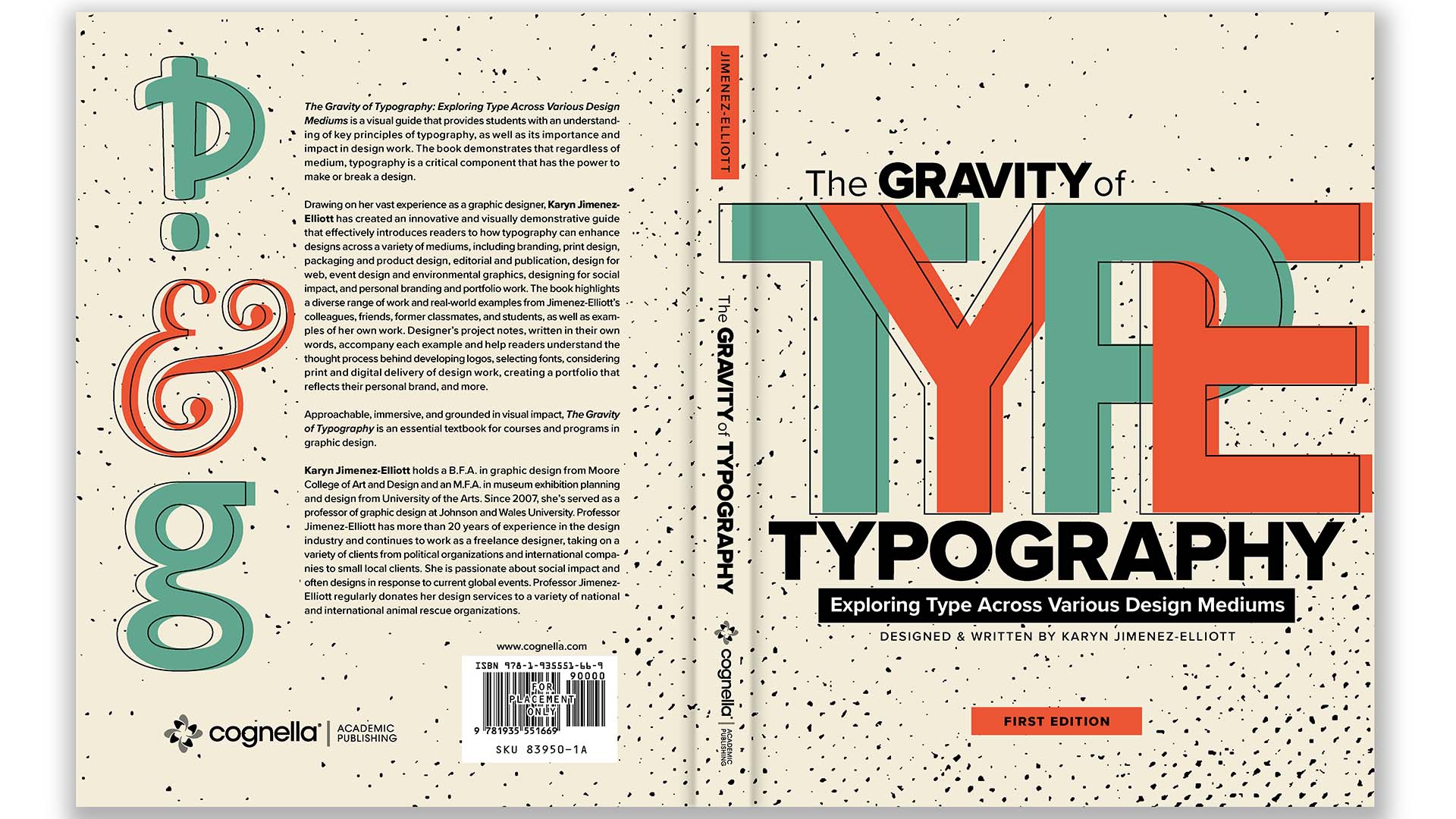
THE COVER OF JIMENEZ-ELLIOTT’S BOOK, “THE GRAVITY OF TYPOGRAPHY.”
What made you choose to write about typography for your book?
After researching me, Cognella Academic Publishing contacted me directly about writing a typography book. I was very hesitant at first. As a person with inattentive ADHD, I couldn’t tell you the last time I was able to focus long enough to read a book in its entirety, and they were asking me to write a book! It was actually that realization that gave me the push; I realized I had to do it. My approach was to write and design the “anti-textbook.” A book for visual learners, jam-packed with content, yet presented in a way that wasn’t overwhelming. I’ve always been passionate about typography and feel that regardless of the design medium, typography is the critical component that has the power to make or break a design. I designed the book as a visual guide to provide readers with an understanding of the principles of typography while gaining an understanding of the gravity it holds.
What were some of the challenges you ran into when writing your book?
One of the biggest challenges was just juggling all of my responsibilities and time. The publisher contacted me in early March of 2022. For it to be in classrooms for testing this Spring, I had to write and design it in completion by July 15, 2022. To complete a book of that size in such a short timeframe wasn’t an easy task. I was teaching full-time, a parent to a 10-year-old that is heavily involved in extracurricular activities, and an active freelance designer. Additional challenges came with the supply shortage of certain paper to the printer, as well as a staff shortage at the publisher when it came to editors and licensing agents.
What is your favorite section of the book and why?
Out of all the specific chapters featuring various mediums and how typography plays an integral role, I would choose the Designing for Social Impact chapter. In all honesty though, my favorite part of the book is the chapter on Introduction to Principles of Typography. I enjoyed the challenge of presenting the content in a new way, paired with demos.
How did you decide on the cover design?
The first task was coming up with a title. When I described to someone what I was going to be writing about, I remember saying, “I want the book to convey the gravity of typography when it comes to making or breaking a design.” With that one sentence, I realized that I wanted the book to be titled, “The Gravity of Typography.” While working on a mood board for a client project, I stumbled upon a vintage advertisement that ended up serving as inspiration. Though the typography and aesthetic were completely opposite from what I was going for, I was drawn to the color palette and textural overlays which ended up being a continual brand asset that carries throughout the publication.
When is it being released, and where can people find it?
Currently, I am using the preliminary edition in my Typography classes I teach here at JWU. I just got word on April 27 that the first edition was sent to the printer! It should be out in the next few weeks on Cognella’s site as well anywhere else you would purchase books online.
Note: The book can be pre-ordered from Cognella here.
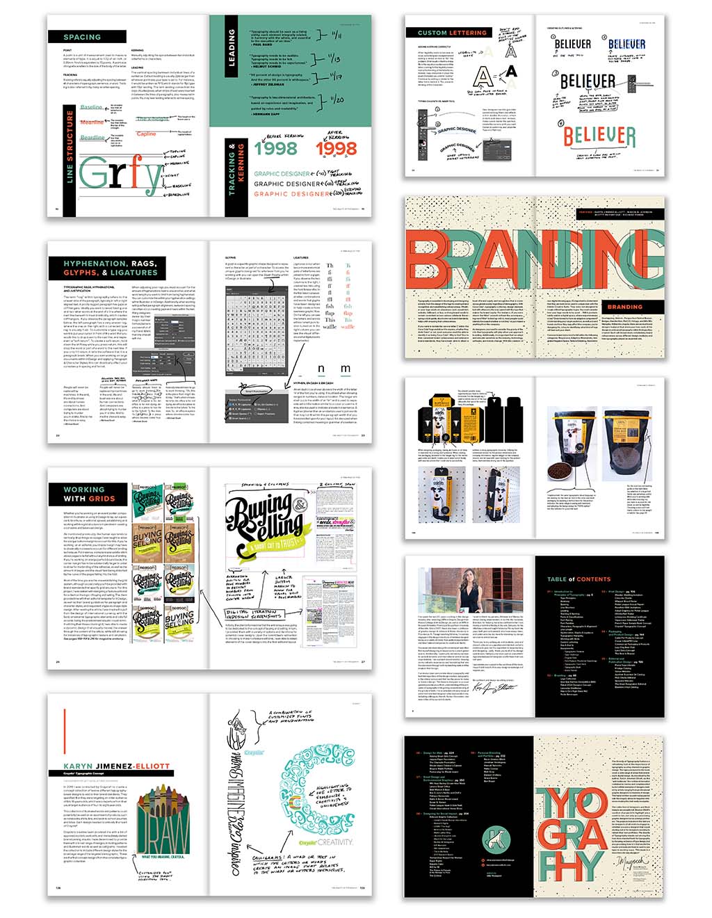
PAGE SPREADS FROM “THE GRAVITY OF TYPOGRAPHY.”


